学习 ggplot2 作图之折饼图
楚新元 / 2026-06-10
饼图结构简单、占比一目了然,大众易理解。使用规范:
- 类别数量控制在 3 ~ 6 类最佳,多余类别可合并为「其它」;
- 标注必须完整:类别名称、占比 / 数值;
- 避免 3D、倾斜效果,会误导视觉判断。
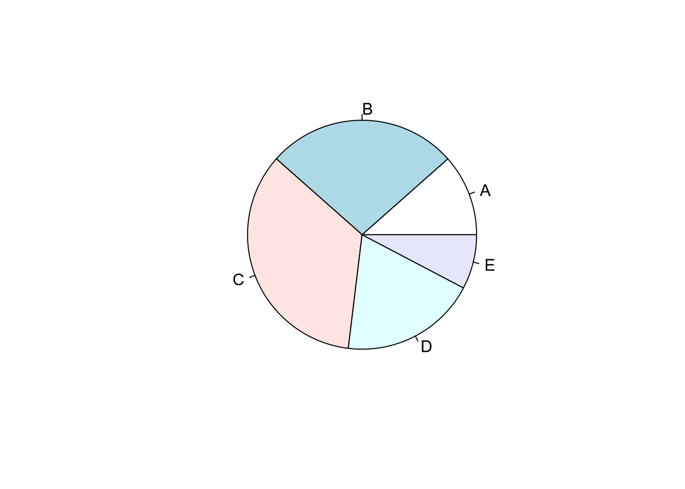
最简单的饼图
sales = c(A = 3, B = 7, C = 9, D = 5, E = 2)
pie(sales)
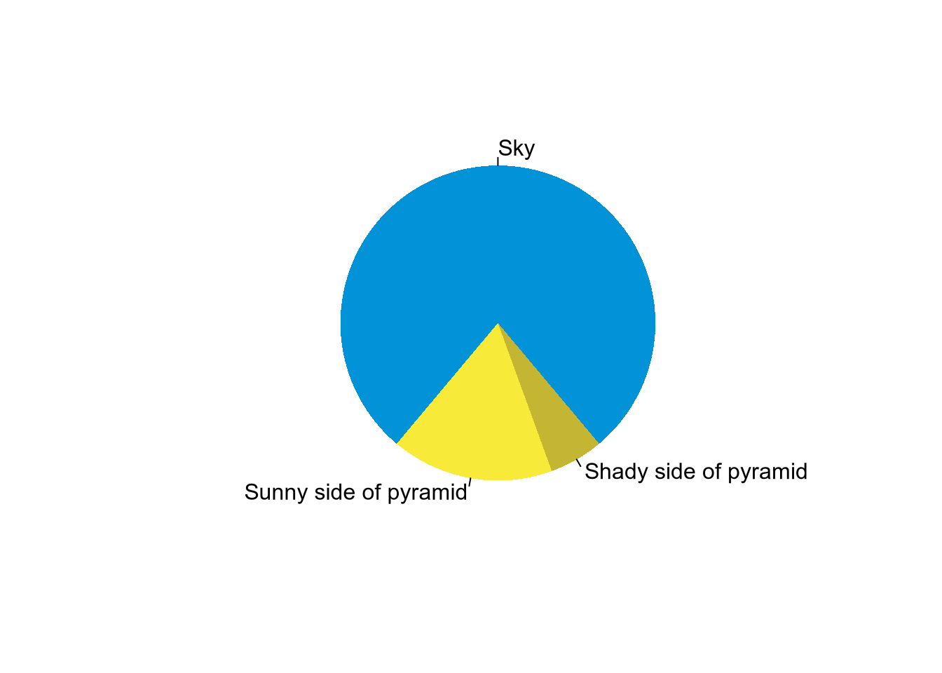
最有趣的饼图1
pie(
  x = c(280, 60, 20),
  labels = c('Sky', 'Sunny side of pyramid', 'Shady side of pyramid'),
  col = c('#0292D8', '#F7EA39', '#C4B632'),
  init.angle = -50,
  border = NA
)
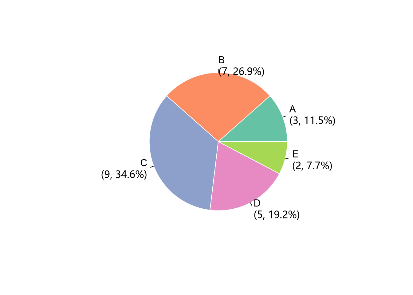
自定义颜色和标签
sales = c(3, 7, 9, 5, 2)
labels = c("A", "B", "C", "D", "E")
pct = scales::percent(sales / sum(sales), accuracy = 0.1)
labels_with_pct = paste0(labels, "\n(", sales, ", ", pct, ")")
pie(
  x = sales,
  labels = labels_with_pct,
  border = "white",
  col = RColorBrewer::brewer.pal(5, "Set2")
)
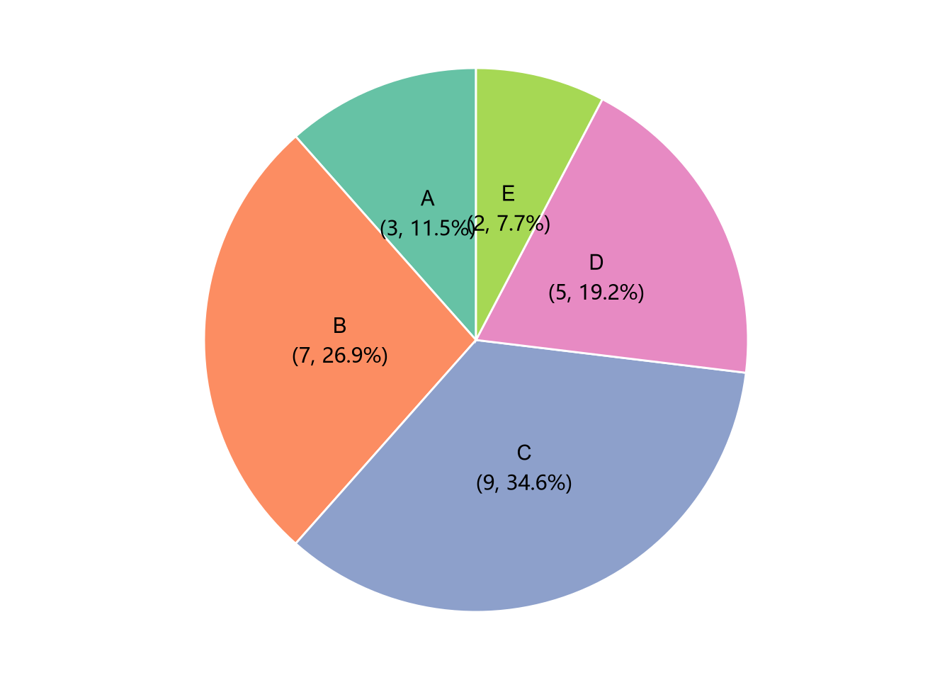
更复杂的个性化定制
library(ggplot2)
sales = c(3, 7, 9, 5, 2)
labels = c("A", "B", "C", "D", "E")
df = data.frame(labels, sales)

df |>
  dplyr::mutate(
    pct = scales::percent(sales / sum(sales), accuracy = 0.1),
    labels_with_pct = paste0(labels, "\n(", sales, ", ", pct, ")")
  ) |>
  ggplot(aes(x = "", y = sales, fill = labels)) +
  geom_bar(stat = "identity", color = "white") +
  coord_polar(theta = "y", start = 0) +
  geom_text(
    aes(label = labels_with_pct),
    position = position_stack(vjust = 0.5)
  ) +
  scale_fill_brewer(palette = "Set2") +
  theme_void() +
  theme(legend.position = "none")
注:以上代码引自谢益辉 2020 年 RStudio 大会报告,详见:https://posit.co/resources/videos/one-r-markdown-document-fourteen-demos。 ↩︎