学习 ggplot2 作图之折线图
楚新元 / 2026-06-10
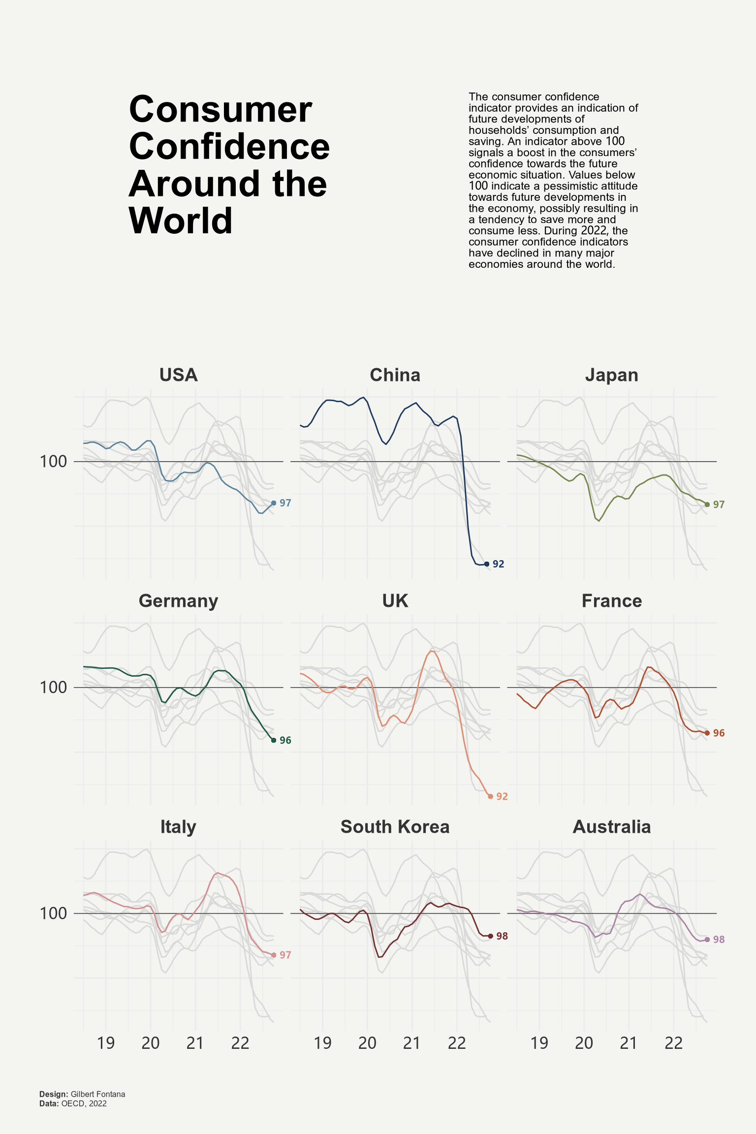
本文参考自 Line chart with small multiple 一文,代码略有修改,供参考。
# 加载相关 R 包
use("dplyr", c("mutate", "select", "slice_max"))
library(ggplot2)
library(ggtext)
library(patchwork)

# 准备数据
# url = "https://raw.githubusercontent.com/holtzy/R-graph-gallery/master/DATA/dataConsumerConfidence.csv"
# ipkg::download_file(url, "dataConsumerConfidence.csv")

# 对数据进行预处理
file_path = "./dataConsumerConfidence.csv"
file_path |>
  read.csv() |>
  mutate(date = lubridate::my(Time)) |>
  select(-Time) |>
  tidyr::pivot_longer(
    cols = !date,
    names_to = "country",
    values_to = "value"
  ) |>
  mutate(
    country = factor(
      x = country,
      levels = c(
        'USA', 'China', 'Japan','Germany', 'UK',
        'France', 'Italy', 'South.Korea', 'Australia'
      ),
      labels = c(
        'USA', 'China', 'Japan','Germany', 'UK',
        'France', 'Italy', 'South Korea', 'Australia'
      )
    )
  ) |>
  na.omit() -> df

# 绘图折线图主体部分
df |>
  ggplot() +
  # 添加基准线
  geom_hline(
    yintercept = 100,
    linetype = "solid",
    linewidth = 0.25,
    color = "#333333"
  ) +
  # 绘制折线图
  geom_line(
    aes(x = date, y = value, color = country)
  ) +
  # 突出数据的同时淡化其它数据
  gghighlight::gghighlight(
    use_direct_label = FALSE,
    unhighlighted_params = list(color = alpha("grey85", 1))
  ) +
  # 添加最后一期数据标签
  geom_point(
    data = df |> slice_max(date, by = country, n = 1),
    aes(x = date, y = value, color = country),
    shape = 16
  ) +
  geom_text(
    data = df |> slice_max(date, by = country, n = 1),
    aes(
      x = date, y = value, color = country,
      label = janitor::round_half_up(value, 0)
    ),
    hjust = -0.5, vjust = 0.5, size = 2.5, fontface = "bold"
  ) +
  # 自定义折线颜色
  scale_color_manual(values = MetBrewer::met.brewer("Redon")) +
  # 设置 x 轴和 y 轴的刻度和标签
  scale_x_date(date_labels = "%y") +
  scale_y_continuous(
    breaks = c(90, 95, 100, 105, 110),
    labels = c("", "", "100", "", "")
  ) +
  # 分面显示不同国家的折线图
  facet_wrap(~ country) +
  # 超出范围不做裁剪
  coord_cartesian(clip = "off") +
  # 美化图形
  theme_minimal() +
  theme(
    legend.position = "none",
    axis.title = element_blank(),
    axis.text = element_text(size = 12, color = "#333333"),
    strip.text = element_text(size = 14, face = "bold", color = "#333333"),
    plot.margin = margin(10, 10, 10, 10),
    plot.background = element_rect(color = "#F4F5F1", fill = "#F4F5F1"),
  ) -> p

# 绘制主标题
text1 = data.frame(
  x = 0, y = 0,
  label = "**Consumer Confidence Around the World**<br>"
)

text1 |>
  ggplot(aes(x = x, y = y)) +
  geom_textbox(
    aes(label = label),
    box.color = "#F4F5F1",
    fill="#F4F5F1",
    width = unit(12, "lines"),
    size = 10,
    lineheight = 1
  ) +
  coord_cartesian(expand = FALSE, clip = "off") +
  theme_void() +
  theme(
    plot.background = element_rect(
      color="#F4F5F1",
      fill="#F4F5F1"
    )
  ) -> title

# 绘制副标题
text2 = data.frame(
  x = 0, y = 0,
  label = "The consumer confidence indicator provides an indication of future developments of households’ consumption and saving. An indicator above 100 signals a boost in the consumers’ confidence towards the future economic situation. Values below 100 indicate a pessimistic attitude towards future developments in the economy, possibly resulting in a tendency to save more and consume less. During 2022, the consumer confidence indicators have declined in many major economies around the world.<br>"
)

text2 |>
  ggplot(aes(x = x, y = y)) +
  geom_textbox(
    aes(label = label),
    box.color = "#F4F5F1",
    fill = "#F4F5F1",
    width = unit(10, "lines"),
    size = 3,
    lineheight = 1
  ) +
  coord_cartesian(expand = FALSE, clip = "off") +
  theme_void() +
  theme(
    plot.background = element_rect(
      color = "#F4F5F1",
      fill = "#F4F5F1"
    )
  ) -> subtitle

# 将主标题、副标题和折线图组合成最终图形
(title + subtitle) / p +
  plot_layout(heights = c(1, 2)) +
  plot_annotation(
    caption = paste0(
      "**Design:** Gilbert Fontana<br>",
      "**Data:** OECD, 2022"
    ),
    theme = theme(
      plot.caption = element_markdown(
        hjust = 0,
        margin = margin(20, 0, 0, 0),
        size = 6,
        color = "#333333",
        lineheight = 1.2
      ),
      plot.margin = margin(20, 20, 20, 20),
      plot.background = element_rect(
        color = "#F4F5F1",
        fill = "#F4F5F1"
      )
    )
  ) -> final_plot

final_plot